Creating a Flutter calculator app is an excellent project for beginners and seasoned developers alike. This guide takes you through the journey of designing, coding, and publishing a feature-rich calculator app. Along the way, we’ll explore essential Flutter development techniques and tips.
Introduction
In today’s fast-paced world, a calculator app is more than just a tool for basic arithmetic; it's an essential companion. My journey of creating a calculator app in Flutter started as a simple project but quickly evolved into a comprehensive learning experience, touching upon UI/UX design, state management, and app optimization for publication. Here’s how I built and polished this app, which I proudly hosted on GitHub for the world to use and learn from.
Setting the Foundation
The project began with a clear goal: to create a fully functional calculator app with a user-friendly interface. I chose Flutter for its flexibility and cross-platform capabilities, which ensured that my app could run smoothly on both Android and iOS.
Key Features of the App:
- Basic arithmetic operations (addition, subtraction, multiplication, division).
- A toggle for light and dark modes to enhance user experience.
- Backspace functionality for error correction.
- A display that retains the full calculation expression (e.g., 2 + 2 = 4).
- Dynamic formatting to remove unnecessary decimal places (e.g., 4.0 displayed as 4).
Setting Up Your Flutter Project
To start building the app, ensure you have Flutter installed on your machine. Here’s how we set up our Flutter calculator app:
Initialize a new Flutter project open your terminal and write this command:
flutter create calculator_app
- Customize the pubspec.yaml file for dependencies (if needed).
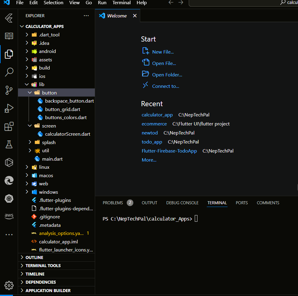
- Create separate directories for screens (/screens) and widgets (/button) in your lib folders.
- In the screen folder we have a file called calculatorScreen.dart and in the button screen we have backspace_button.dart, button_gride.dart, buttons_colors.dart.

This structure keeps your project organized, especially when adding new features.
Getting Started with Coding: Writing the main.dart
After setting up your Flutter project and planning your features, it’s time to dive into coding! We’ll start with the main.dart file, the entry point of every Flutter application. Here, we’ll define the basic structure of our Flutter calculator app and integrate themes and routing.
The main.dart file is the starting point for our Flutter calculator app. It sets up the app’s theme, navigation, and initial screen.
// main.dart
import 'package:calculator_app/screen/calculatorScreen.dart';
import 'package:flutter/material.dart';

void main() {
  runApp(MyApp());
}

class MyApp extends StatefulWidget {
  @override
  _MyAppState createState() => _MyAppState();
}

class _MyAppState extends State<MyApp> {
  bool isDarkMode = false; // Default theme is light

  // Toggle between light and dark mode
  void toggleTheme() {
    setState(() {
      isDarkMode = !isDarkMode;
    });
  }

  @override
  Widget build(BuildContext context) {
    return MaterialApp(
      title: 'Flutter Calculator',
      theme: ThemeData.light(), // Light mode theme
      darkTheme: ThemeData.dark(), // Dark mode theme
      themeMode: isDarkMode ? ThemeMode.dark : ThemeMode.light, // Set the theme mode
      debugShowCheckedModeBanner: false,
      home: CalculatorScreen(toggleTheme: toggleTheme), // Pass the toggleTheme to CalculatorScreen
    );
  }
}
Key Highlights of main.dart
- Dynamic Theme: Users can toggle between light and dark modes with the toggleTheme() function.
- Navigation Setup: The CalculatorScreen is set as the initial screen of the app.
- Clean Structure: Maintains flexibility for adding features later.
With the foundation ready, we’ll now code the CalculatorScreen to bring the app to life!
Building the CalculatorScreen: Creating the Core User Interface
The CalculatorScreen is the heart of our Flutter calculator app. This is where we design the user interface and implement the core logic for calculations.
// screen/calculator_screen.dart
import 'package:calculator_app/button/backspace_button.dart';
import 'package:calculator_app/button/button_grid.dart';
import 'package:flutter/material.dart';

class CalculatorScreen extends StatefulWidget {
  final Function toggleTheme;

  CalculatorScreen({required this.toggleTheme});

  @override
  _CalculatorScreenState createState() => _CalculatorScreenState();
}

class _CalculatorScreenState extends State<CalculatorScreen> {
  String displayText = '0';
  String input = '';
  String calculationHistory = ''; // To store expressions like "2+2=4"
  double? result;
  String? operator;
  bool newNumber = false;

  // Function to handle button presses
  void onButtonPressed(String buttonText) {
    setState(() {
      if (buttonText == 'C') {
        clearAll();
      } else if (buttonText == '=') {
        if (operator != null) {
          calculateResult();
          displayText = '$calculationHistory'; // Format: [2+2=4]
          newNumber = true;
        }
      } else if (['+', '-', '*', '/'].contains(buttonText)) {
        handleOperator(buttonText);
      } else {
        handleNumber(buttonText);
      }
    });
  }

  void clearAll() {
    displayText = '0';
    input = '';
    calculationHistory = '';
    result = null;
    operator = null;
    newNumber = false;
  }

  void handleOperator(String buttonText) {
    if (operator != null && input.isNotEmpty) {
      calculateResult();
    } else if (input.isNotEmpty) {
      result = double.tryParse(input); // Initialize result if not set
    }

    operator = buttonText;
    calculationHistory = '${formatResult(result ?? 0)} $operator';
    displayText = calculationHistory;
    input = '';
    newNumber = true;
  }

  void handleNumber(String buttonText) {
    if (buttonText == '.' && input.contains('.')) return;

    if (newNumber) {
      input = buttonText;
      newNumber = false;
    } else {
      input += buttonText;
    }

    displayText = input;
  }

  void calculateResult() {
    if (input.isEmpty || operator == null) return;

    double currentInput = double.tryParse(input) ?? 0;

    switch (operator) {
      case '+':
        result = (result ?? 0) + currentInput;
        break;
      case '-':
        result = (result ?? 0) - currentInput;
        break;
      case '*':
        result = (result ?? 0) * currentInput;
        break;
      case '/':
        if (currentInput != 0) {
          result = (result ?? 0) / currentInput;
        } else {
          displayText = 'Error'; // Division by zero
          return;
        }
        break;
    }

    calculationHistory += '$input = ${formatResult(result ?? 0)}';
    input = '';
    operator = null;
  }

  String formatResult(double result) {
    return result == result.toInt() ? result.toInt().toString() : result.toString();
  }

  @override
  Widget build(BuildContext context) {
    return Scaffold(
      appBar: AppBar(
        title: Text('Calculator'),
        actions: [
          IconButton(
            icon: Icon(Icons.nightlight_round),
            onPressed: () => widget.toggleTheme(),
          ),
        ],
      ),
      body: Column(
        children: [
          Expanded(
            child: Container(
              alignment: Alignment.bottomRight,
              padding: EdgeInsets.all(24),
              child: Text(
                displayText,
                style: TextStyle(fontSize: 48, fontWeight: FontWeight.bold),
              ),
            ),
          ),
          Divider(),
          ButtonGrid(onButtonPressed: onButtonPressed),
        ],
      ),
      floatingActionButton: BackspaceButton(onBackspacePressed: () {
        setState(() {
          if (input.isNotEmpty) {
            input = input.substring(0, input.length - 1);
            displayText = input.isEmpty ? '0' : input;
          }
        });
      }),
    );
  }
}
Key Features of CalculatorScreen
- Dynamic Display: Displays the current input, operator, and result in real-time.
- Flexible Logic: Handles all basic operations (+, -, *, /) and supports floating-point numbers.
- Error Handling: Displays "Error" when dividing by zero.
- Theme Integration: Includes a toggle for light and dark modes.
In the next , we will focus on coding the reusable components like the ButtonGrid and BackspaceButton. These widgets ensure a clean, modular, and scalable architecture for the app.
Creating the Button Folder for Modular Widgets
The button folder contains reusable components that bring the CalculatorScreen to life. It includes:
- backspace_button.dart: Handles the backspace functionality.
- button_grid.dart: Displays the grid of calculator buttons.
- button_colors.dart: Manages consistent button styling.
1. backspace_button.dart
This file defines the backspace button to delete the last digit of the current input.
import 'package:flutter/material.dart';

class BackspaceButton extends StatelessWidget {
  final VoidCallback onBackspacePressed;

  BackspaceButton({required this.onBackspacePressed});

  @override
  Widget build(BuildContext context) {
    return FloatingActionButton(

      onPressed: onBackspacePressed, // Handle backspace press
      child: Icon(Icons.backspace,color: Colors.brown,),
      tooltip: 'Backspace',
    );
  }
}
Key Features:
- Displays a dynamic grid of calculator buttons.
- Applies unique styles to operators, numbers, and functional keys using the ButtonColors class.
- Calls the onButtonPressed function to handle button interactions.
2. button_grid.dart
This file defines the grid layout for calculator buttons.
// button_grid.dart
import 'package:calculator_app/button/buttons_colors.dart';
import 'package:flutter/material.dart';

class ButtonGrid extends StatelessWidget {
  final Function(String) onButtonPressed;

  ButtonGrid({required this.onButtonPressed});

  @override
  Widget build(BuildContext context) {
    final buttons = [
      '7', '8', '9', '/',
      '4', '5', '6', '*',
      '1', '2', '3', '-',
      'C', '0', '+', '=',
    ];

    return Expanded(
      flex: 3,
      child: GridView.builder(
        gridDelegate: SliverGridDelegateWithFixedCrossAxisCount(
          crossAxisCount: 4, // 4 buttons per row
        ),
        itemCount: buttons.length,
        itemBuilder: (context, index) {
          return CalculatorButton(
            text: buttons[index],
            onTap: () => onButtonPressed(buttons[index]),
          );
        },
      ),
    );
  }
}
Key Features:
- Displays a dynamic grid of calculator buttons.
- Applies unique styles to operators, numbers, and functional keys using the ButtonColors class.
- Calls the onButtonPressed function to handle button interactions.
3. button_colors.dart
This file centralizes the styling for buttons, ensuring consistency.
import 'dart:ui';

import 'package:flutter/material.dart';

class CalculatorButton extends StatelessWidget {
  final String text;
  final VoidCallback onTap;

  CalculatorButton({required this.text, required this.onTap});

  @override
  Widget build(BuildContext context) {
    return GestureDetector(
      onTap: onTap,
      child: Container(
        margin: EdgeInsets.all(8),
        decoration: BoxDecoration(
          color: _getButtonColor(text),
          borderRadius: BorderRadius.circular(8),
        ),
        child: Center(
          child: Text(
            text,
            style: TextStyle(color: Colors.white, fontSize: 24),
          ),
        ),
      ),
    );
  }

  // Function to get the button color based on button type
  Color _getButtonColor(String buttonText) {
    if (['+', '-', '*', '/', '='].contains(buttonText)) {
      return Colors.orangeAccent; // Operator and equals buttons
    } else if (buttonText == 'C') {
      return Colors.redAccent; // Clear button
    } else {
      return Colors.blueAccent; // Number buttons
    }
  }
}
Key Features:
- getButtonColor: Differentiates colors for operators, numbers, and clear buttons.
getTextColor: Adjusts text color based on button type.
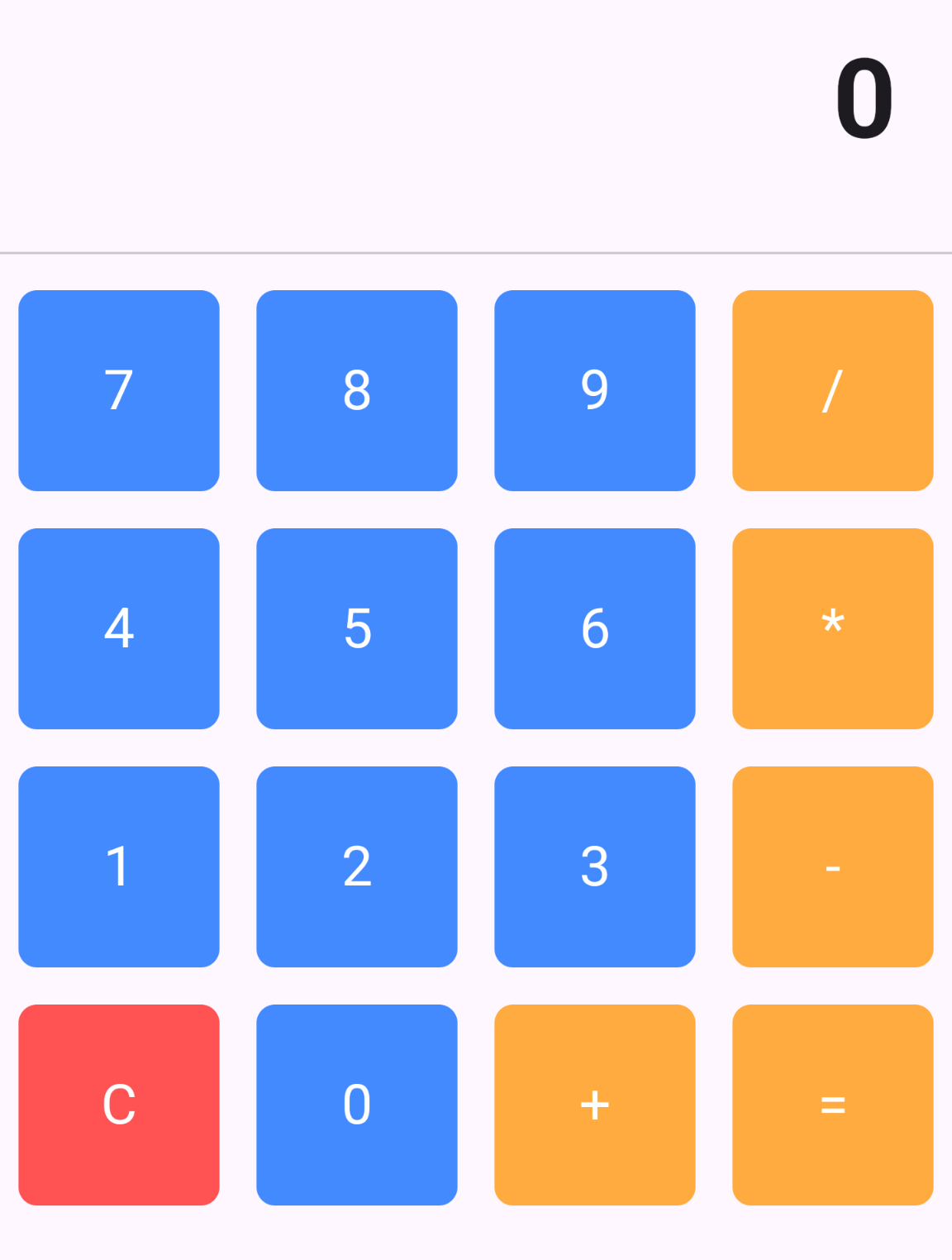
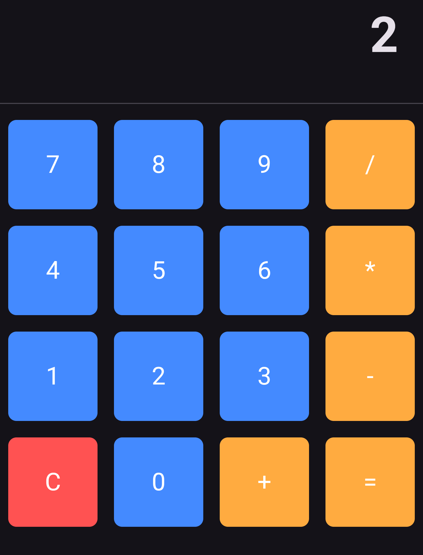
And here is the overall looks of our project after
Why This Structure?
This structure is designed to keep the codebase clean, modular, and easy to scale without using external state management like Provider. By separating the app into distinct components such as the CalculatorScreen, button widgets, and calculation logic, we ensure that each part is focused on a specific task. This makes the app easier to maintain and expand. We use a simple state management approach with setState to update the UI, keeping things lightweight and easy to follow, while still ensuring a smooth user experience with features like dark/light mode switching and error handling.
Conclusion
Creating this calculator app with a simple, modular structure demonstrates the power of Flutter’s UI framework and its ability to handle basic functionalities like arithmetic operations and theme switching. Without the complexity of external state management tools, the app remains easy to develop, test, and expand. This structure sets the foundation for future enhancements such as adding scientific functions, memory storage, or even integrating a more complex user interface.
Final Thoughts
And here is the complete look of our project after all the hard work and dedication! If you have any questions or need further assistance, feel free to reach out to us through our social media handles or drop us an email [neptechpal355@gmail.com]. Our team is always ready to help and guide you with a professional approach.
Light Theme

Dark Theme

Explore the Project
You can check out the project on our GitHub repository. Simply copy the code, run it, and see how it functions firsthand. Click the link below to access the repository and explore the detailed implementation:
GitHub Repository: https://github.com/Abhi98989/calculator_Apps
We hope this project inspires your journey in Flutter app development. Happy coding!
